
Color accessibility is more than just a design trend - it’s a fundamental part of inclusive digital experiences. Millions of people around the world live with color vision deficiencies, and without accessible color choices, your design could become unreadable to them. Thankfully, tools like DeficiencyView make it easy to preview your work through the eyes of users with color blindness - before you hit publish.
Why Simulate Color Blindness?
Roughly 1 in 12 men and 1 in 200 women experience some form of color blindness. Common types include:
- Deuteranopia (red-green color blindness)
- Protanopia (red-blind)
- Tritanopia (blue-yellow color blindness)
When your design relies heavily on color to communicate important information - like status indicators, buttons, or alerts - it may become inaccessible without you realizing. That’s where simulation tools help.
What is DeficiencyView?
DeficiencyView is a free, browser-based simulator that allows you to view your designs as they would appear to people with different types of color blindness. It’s fast, simple, and doesn’t require installation.
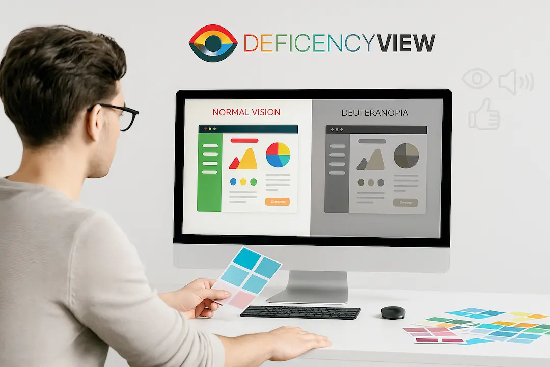
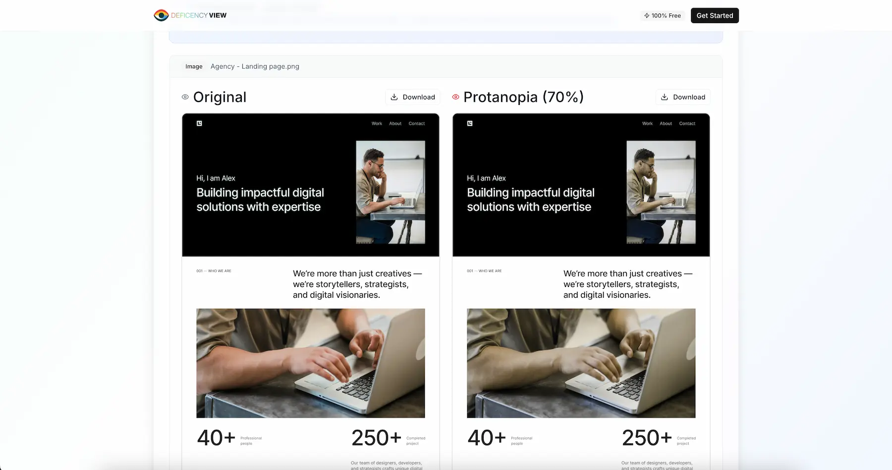 DeficiencyView showing side-by-side comparison of normal vision vs Deuteranopia simulation
Key Features:
✅ Upload any design image or screenshot
✅ Simulate all major types of color deficiencies
✅ Compare side-by-side views
✅ Completely free and private - no login required
How to Use DeficiencyView
- Go to deficiencyview.com
- Upload a PNG or JPG of your design
- Choose a color deficiency type (e.g., Deuteranopia, Protanopia)
- View and compare how your design changes
- Make adjustments to your color palette if needed, based on what you see
It takes less than a minute to spot critical visibility issues.
Quick Tips for Accessible Color Design
- Use high contrast between text and background
- Don’t rely solely on color to convey meaning (use icons, labels, textures)
- Pair colors with readable fonts and generous spacing
- Always test with a tool like DeficiencyView before launching
Best Practices for Color Accessibility
1. Color Contrast Ratios
Ensure your text meets WCAG guidelines:
- Normal text: 4.5:1 contrast ratio
- Large text: 3:1 contrast ratio
2. Multiple Visual Cues
Don’t rely on color alone:
- Use icons alongside colors
- Add text labels
- Include patterns or textures
3. Test Early and Often
Make accessibility testing part of your regular design workflow:
- Test during the design phase
- Test with real users when possible
- Use multiple simulation tools
Conclusion
Inclusive design starts with awareness, and tools like DeficiencyView give you the clarity to make better choices. Whether you’re building a website, designing an app, or crafting user interfaces, testing your work for color accessibility should be a non-negotiable part of your process.
Ready to make your designs more accessible?
Try DeficiencyView now →
Remember: Accessible design isn’t just good practice - it’s good business. By ensuring your designs work for everyone, you’re expanding your potential audience and creating better user experiences.