

Figma to Elementor: Complete Conversion Guide 2026
You’ve spent hours perfecting your Figma design. The spacing is pixel-perfect, the typography is balanced, and your client loves it. Now comes the part that makes most designers groan: converting it all into a working Elementor website.
The traditional approach manually recreating every element in Elementor—can easily consume 8-15 hours for a standard landing page. That’s time you could spend on actual design work, client acquisition, or simply not staring at WordPress.
This guide changes that equation entirely. Whether you prefer manual precision, semi-automated workflows, or full AI-powered conversion, you’ll learn exactly how to transform Figma designs into production-ready Elementor templates. We’ll cover the complete workflow from design preparation through final optimization, including the specific techniques that reduce conversion time from hours to minutes.
By the end, you’ll have a repeatable system for any Figma-to-Elementor project—one that maintains design fidelity while actually saving you time.
Why Converting Figma to Elementor Matters for Modern Web Projects
The Figma-to-Elementor workflow has become the dominant design-to-development pipeline for WordPress projects. Understanding why helps you approach conversions strategically rather than mechanically.
The Designer-Developer Gap Problem
Figma operates on vector-based, infinitely scalable design principles. Elementor works within WordPress’s container-based, CSS-driven reality. These two systems speak different languages:
| Figma Concept | Elementor Equivalent | Translation Challenge |
|---|---|---|
| Auto-layout | Flexbox containers | Direction, gap, padding mapping |
| Frames | Sections/Containers | Nesting depth limits |
| Components | Global widgets | Sync and override behavior |
| Constraints | Responsive settings | Breakpoint-specific rules |
| Variants | Dynamic content | Conditional display logic |
When these translations happen manually, inconsistencies creep in. A 24px gap in Figma becomes “about 25px” in Elementor. Font weights shift. Responsive behavior diverges from the original design intent.
The Business Case for Efficient Conversion
Project economics favor faster, more accurate conversions:
- Agency profitability: A 5-page site converted in 2 hours vs. 10 hours represents an 80% labor reduction
- Client satisfaction: Designs that match mockups exactly reduce revision cycles by 60-70%
- Scalability: Efficient workflows let you take on more projects without proportional team growth
For freelancers charging project rates, conversion efficiency directly impacts hourly earnings. For agencies, it’s the difference between profitable projects and break-even work.
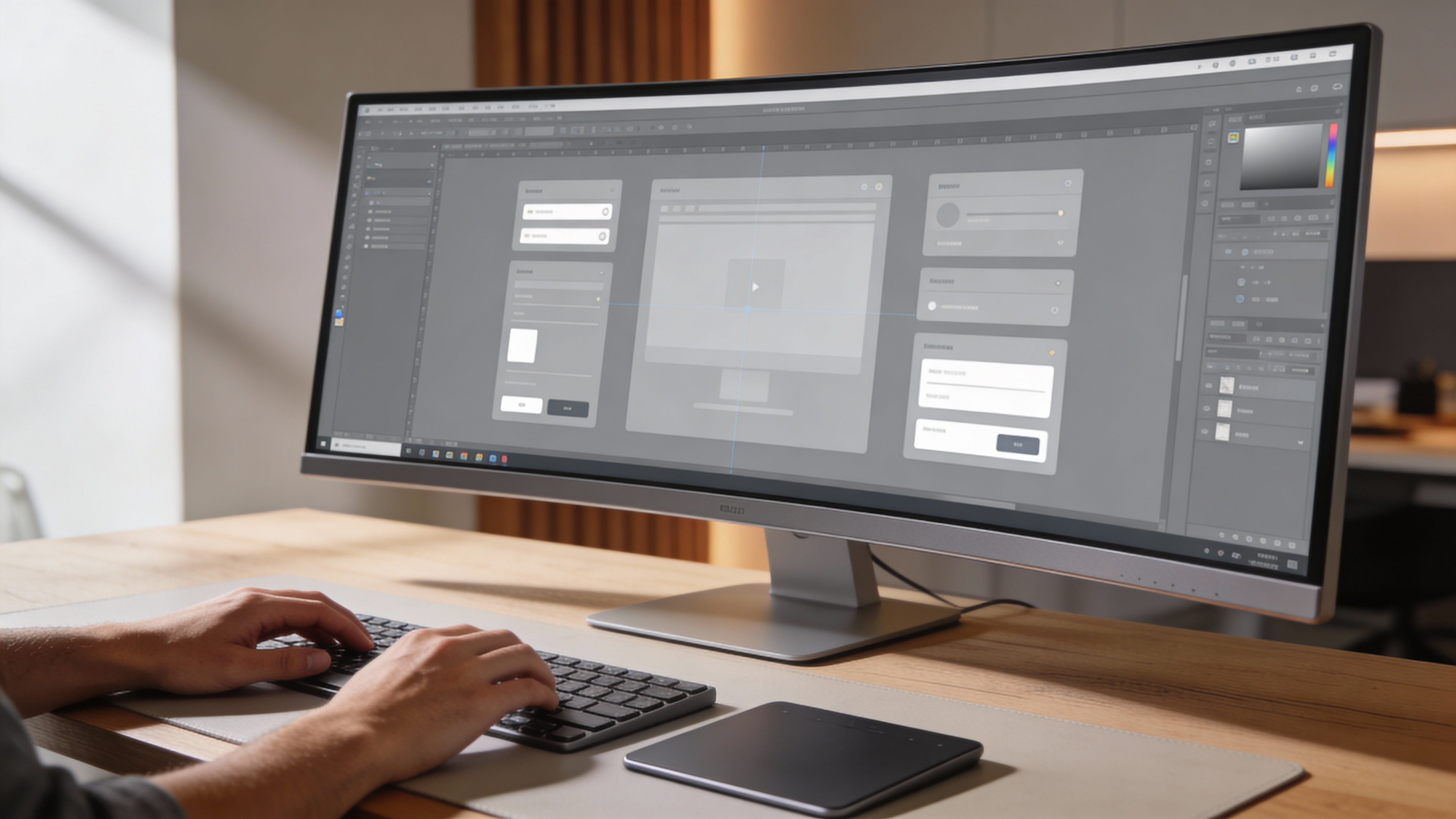
Preparing Your Figma Design for Elementor Export
Before any conversion—manual or automated—your Figma file needs specific preparation. Skipping this step is the number one cause of conversion headaches.
Structuring Frames for Clean Export
Elementor thinks in sections, containers, and widgets. Your Figma structure should mirror this hierarchy:
Optimal Frame Structure:
Page Frame (1440px width)
├── Section Frame (Header)
│   └── Container Frame
│       ├── Logo Group
│       └── Navigation Group
├── Section Frame (Hero)
│   └── Container Frame
│       ├── Text Group (Heading + Subheading)
│       └── CTA Group (Buttons)
└── Section Frame (Features)
    └── Container Frame
        └── Feature Cards (Auto-layout)
Key Preparation Steps:
- Use auto-layout everywhere: Elements without auto-layout convert to absolute positioning, breaking responsiveness
- Name layers semantically: “hero-heading” converts better than “Rectangle 47”
- Flatten complex vectors: Overly nested groups create bloated widget structures
- Set constraints correctly: How elements resize determines responsive behavior
Typography and Color System Setup
Elementor pulls from your design tokens. Inconsistent values create manual cleanup work:
Typography Checklist:
- All text uses defined type styles (not local overrides)
- Font weights match Google Fonts or your hosted fonts exactly
- Line heights use consistent ratios (1.4-1.6 for body, 1.1-1.2 for headings)
- Letter spacing values are standardized
Color System Checklist:
- All colors reference your color styles (not hex overrides)
- Opacity is applied to elements, not embedded in colors
- Gradients use consistent stop positions
- Shadows use your elevation system
Component Preparation for Reusable Elements
Figma components become Elementor global widgets—but only if structured correctly:
- Atomic components: Buttons, form fields, tags should be smallest building blocks
- Molecular components: Cards, testimonials, feature blocks combine atomic elements
- Organism components: Headers, footers, hero sections contain multiple molecules
This hierarchy maps directly to Elementor’s saved template system, enabling true design system translation.
Manual Conversion Method: Step-by-Step Process
Manual conversion gives you maximum control. It’s ideal for complex designs, highly custom interactions, or when you need to optimize for performance beyond automated output.
Step 1: Section and Container Setup
Start with the structural skeleton:
- Create Elementor sections matching your Figma section frames
- Add containers with the same flex direction as your Figma auto-layout
- Set container widths to match your design’s max-width (typically 1200-1440px)
- Configure padding using Figma’s exact values
Pro Tip: Use Elementor’s “Copy Style” feature after setting up one container correctly. Apply to similar containers for consistency.
Step 2: Typography Implementation
Text conversion requires attention to detail:
Add heading/text widgets for each text element
Match typography settings exactly:
- Font family (ensure it’s available in Elementor)
- Font size (use Figma’s exact values)
- Font weight (map to available weights)
- Line height (convert to unitless or em values)
- Letter spacing (convert to em if using px in Figma)
Set responsive typography at each breakpoint:
- Tablet: typically 90-95% of desktop size
- Mobile: typically 80-90% of desktop size
Step 3: Spacing and Layout Precision
Spacing errors are the most visible conversion mistakes:
Container Spacing:
- Padding: Inner spacing from container edge
- Gap: Space between flex children (requires Flexbox Container)
- Margin: Outer spacing (use sparingly)
Extracting Values from Figma:
- Select the parent frame in Figma
- Check auto-layout settings for gap values
- Check padding in the design panel
- Note any responsive changes between frames
Step 4: Image and Asset Implementation
Images require export and optimization:
- Export images at 2x resolution for retina displays
- Use WebP format with JPEG/PNG fallback
- Set lazy loading for below-fold images
- Configure aspect ratios to prevent layout shift
For background images:
- Export at exact container dimensions
- Use CSS object-fit for responsive behavior
- Consider separate mobile exports for hero sections
Step 5: Interactive States and Animations
Figma prototypes don’t directly translate, but you can recreate:
Hover States:
- Button color changes
- Card lift effects (transform + shadow)
- Link underline animations
Scroll Animations (Elementor Pro):
- Fade in on viewport entry
- Parallax background movement
- Sticky elements
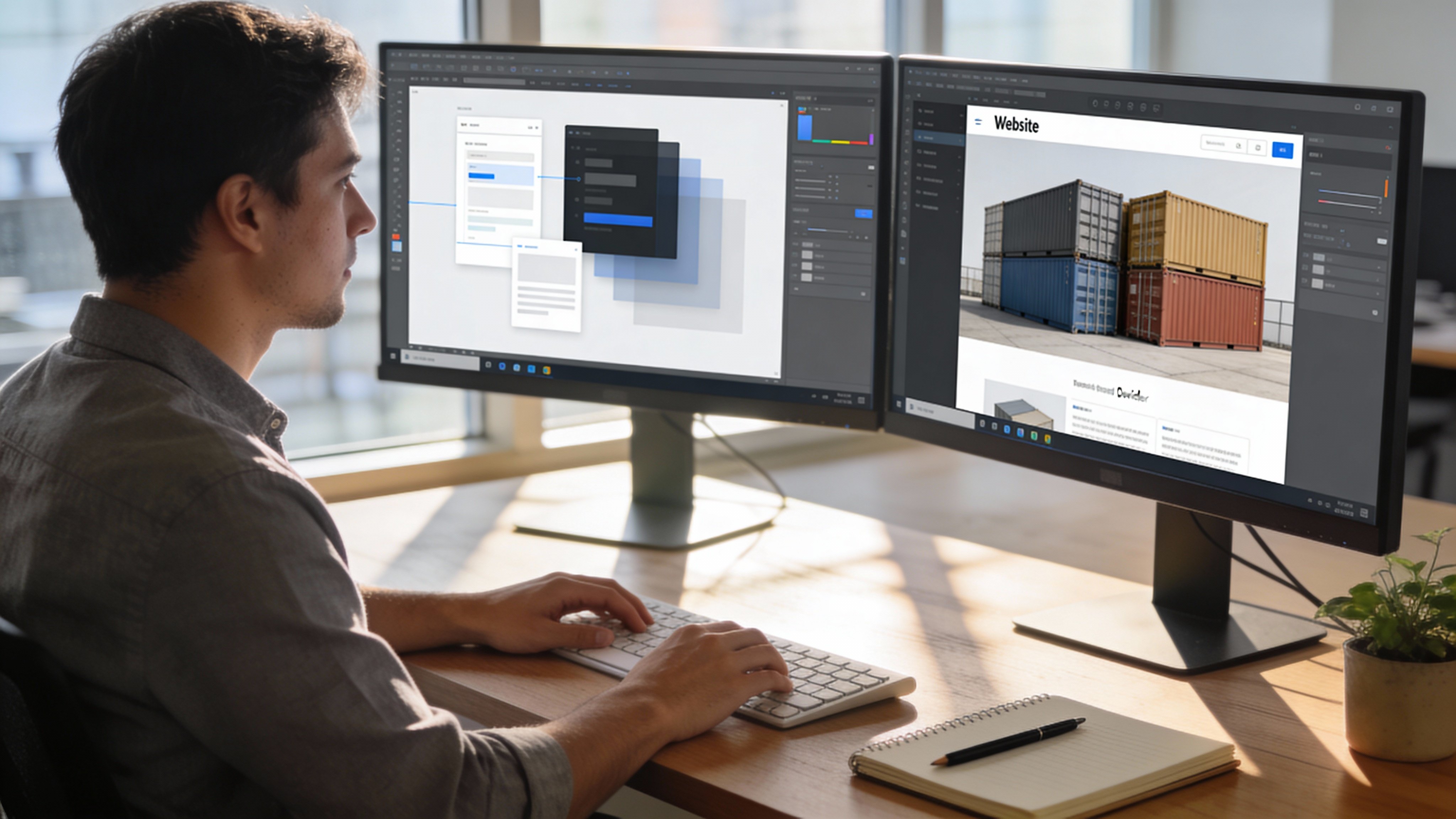
Automated Conversion with Figmentor
Manual conversion works, but it doesn’t scale. When you’re handling multiple projects or complex designs, automation becomes essential.
Tools like Figmentor transform the conversion process by reading your Figma design’s underlying structure—auto-layout settings, component hierarchies, and style values—then generating equivalent Elementor JSON that imports directly into WordPress.
How Automated Conversion Works
The technical process involves several translation layers:
- Figma API extraction: Reads node tree, styles, and layout properties
- Semantic mapping: Converts Figma concepts to Elementor equivalents
- JSON generation: Creates Elementor-compatible template format
- Import processing: WordPress plugin handles template insertion
What takes 4-8 hours manually happens in under 5 minutes with automated tools. The real value isn’t just speed—it’s consistency. Every spacing value, every font size, every color matches your Figma design exactly.
When Automation Makes Sense
Automated conversion excels in specific scenarios:
Ideal Use Cases:
- Landing pages with standard component patterns
- Marketing sites with multiple similar pages
- Rapid prototyping and client previews
- Template-based projects with consistent structure
Consider Manual Conversion When:
- Highly experimental layouts with unusual nesting
- Sites requiring significant Elementor-specific features
- Projects where learning the conversion process matters
- One-off microsites where setup time exceeds conversion time
Optimizing Automated Output
Even the best automated conversion benefits from post-processing:
- Review container structure: Simplify any over-nested elements
- Verify responsive breakpoints: Adjust tablet/mobile as needed
- Check interactive elements: Add hover states and animations
- Optimize for performance: Enable lazy loading, compress assets
Handling Common Conversion Challenges
Every Figma-to-Elementor project encounters specific obstacles. Here’s how to handle the most frequent issues.
Auto-Layout to Flexbox Translation
Figma’s auto-layout and Elementor’s flexbox containers are conceptually similar but have implementation differences:
Common Issues:
- Wrap behavior: Figma allows “Wrap” on auto-layout; Elementor needs explicit flex-wrap settings
- Space between/around: Figma’s distribution options map to justify-content values
- Fixed vs. hug sizing: Translates to flex-grow and fixed width combinations
Solution Approach:
Figma "Hug contents" → Elementor width: auto (fit content)
Figma "Fill container" → Elementor width: 100% or flex-grow
Figma "Fixed" → Elementor specific pixel/percentage width
Responsive Design Translation
Figma’s constraint system differs fundamentally from CSS media queries:
Figma Constraints:
- Relative to parent frame edges
- Scale or fix behavior
Elementor Responsive:
- Breakpoint-specific overrides
- Mobile-first or desktop-first cascade
Best Practice: Design separate Figma frames for each breakpoint (desktop, tablet, mobile) rather than relying on constraint-based responsiveness. This gives explicit values for Elementor configuration.
Complex Gradient and Effect Handling
Figma’s layer effects need careful translation:
| Figma Effect | Elementor Implementation |
|---|---|
| Drop shadow | Box shadow (element settings) |
| Inner shadow | Box shadow with inset |
| Layer blur | CSS backdrop-filter (limited support) |
| Background blur | Custom CSS required |
| Multiple fills | Stacked backgrounds or overlays |
For complex effects, consider:
- Exporting as images for non-critical decorative elements
- Using custom CSS for advanced effects
- Simplifying for performance on mobile devices
Font Matching and Fallbacks
Typography inconsistencies often stem from font availability:
Checklist:
- Verify your Figma fonts are Google Fonts or self-hosted
- Check font weight availability (not all fonts have all weights)
- Set proper fallback stacks in Elementor global settings
- Test on systems without your fonts installed
Common Substitutions:
- Figma “Inter” → Elementor “Inter” (direct match, Google Fonts)
- Figma “SF Pro” → Elementor “system-ui” fallback or similar sans-serif
- Figma custom fonts → Self-hosted @font-face implementation
Performance Optimization After Conversion
A converted design that loads slowly defeats the purpose. Post-conversion optimization is non-negotiable.
Image Optimization Pipeline
Images typically account for 60-80% of page weight:
- Resize to actual display size: A 2000px image displayed at 600px wastes bandwidth
- Convert to WebP: 25-35% smaller than equivalent JPEG quality
- Implement lazy loading: Defer off-screen images
- Use responsive images: srcset for different viewport sizes
Target Metrics:
- Largest Contentful Paint (LCP): Under 2.5 seconds
- Total image weight: Under 500KB for standard pages
- Hero image: Under 150KB after optimization
Code Efficiency Improvements
Elementor’s output can be optimized:
- Remove unused widgets: Each widget adds CSS/JS overhead
- Minimize custom CSS: Use Elementor’s built-in options when possible
- Audit third-party integrations: Each script adds load time
Mobile Performance Priorities
Mobile users on cellular connections need special consideration:
- Reduce DOM complexity: Fewer nested containers improve render time
- Optimize touch targets: 44px minimum for buttons and links
- Test on real devices: Emulators miss actual performance characteristics
Quality Assurance Workflow
Before launching any converted design, run through systematic checks.
Visual Regression Testing
Compare your live Elementor site against the Figma design:
- Full-page screenshots: Capture desktop, tablet, and mobile views
- Overlay comparison: Use tools to highlight visual differences
- Interaction testing: Verify all hover states and animations
Cross-Browser Verification
Test across browser rendering engines:
- Chromium (Chrome, Edge, Brave): Primary target
- Firefox: Check flexbox edge cases
- Safari: Verify WebP fallbacks, iOS-specific behaviors
Accessibility Audit
Ensure your conversion maintains accessibility:
- Heading hierarchy (H1 → H2 → H3, no skipping)
- Alt text for all images
- Color contrast (4.5:1 for normal text, 3:1 for large text)
- Keyboard navigation for interactive elements
- Focus states visible and clear
Building a Repeatable Conversion System
One-off conversions are inefficient. Build systems that compound your efficiency over time.
Template Libraries
Create reusable Elementor templates from common patterns:
- Header variations: Standard, transparent, mega-menu
- Hero sections: Centered, split, video background
- Feature blocks: Grid, alternating, icon-based
- Footer layouts: Multi-column, minimal, newsletter-integrated
Save these in Elementor’s template library for instant reuse across projects.
Design System Synchronization
Maintain consistency between Figma and Elementor:
- Global colors: Match Figma color styles to Elementor global colors
- Global fonts: Define type scale in both systems identically
- Spacing scale: Use consistent 4px or 8px base unit
When your design system changes in Figma, update Elementor globals once—changes cascade throughout your templates.
Documentation for Team Handoffs
If you work with others, document your conversion process:
- Naming conventions for layers and widgets
- Standard breakpoint values and behaviors
- Quality checklist for final review
- Known limitations and workarounds
Conclusion: Your Figma-to-Elementor Action Plan
Converting Figma designs to Elementor doesn’t have to be the bottleneck in your web development workflow. Whether you choose manual conversion for maximum control or automated tools like Figmentor for speed and consistency, the principles remain the same:
- Prepare your Figma file properly: Clean structure, named layers, and defined styles make conversion smoother
- Understand the translation: Know how Figma concepts map to Elementor equivalents
- Optimize the output: Post-conversion performance work is essential, not optional
- Build reusable systems: Templates and design systems compound your efficiency over time
Start with your next project. Pick the method that matches your timeline and complexity—manual for learning and control, automated for production speed. Either way, you’ll deliver pixel-perfect WordPress sites that match your Figma designs exactly.
The gap between design and development doesn’t have to exist. With the right workflow, they become one continuous process.
Related Articles
- How to Convert Figma to Elementor
- Figma to Elementor Plugin Comparison
- Elementor Workflow Optimization Guide
- WordPress Design System Setup
- Responsive Design Best Practices
- Elementor Performance Optimization
- Figma Auto-Layout Tutorial
- WordPress Speed Optimization Guide
- Design Handoff Best Practices
- Elementor Container Tutorial
- Figma Component Library Setup
- WordPress Accessibility Guide
- Landing Page Design Templates
- Elementor Global Widgets Guide
- Web Design Workflow Automation