
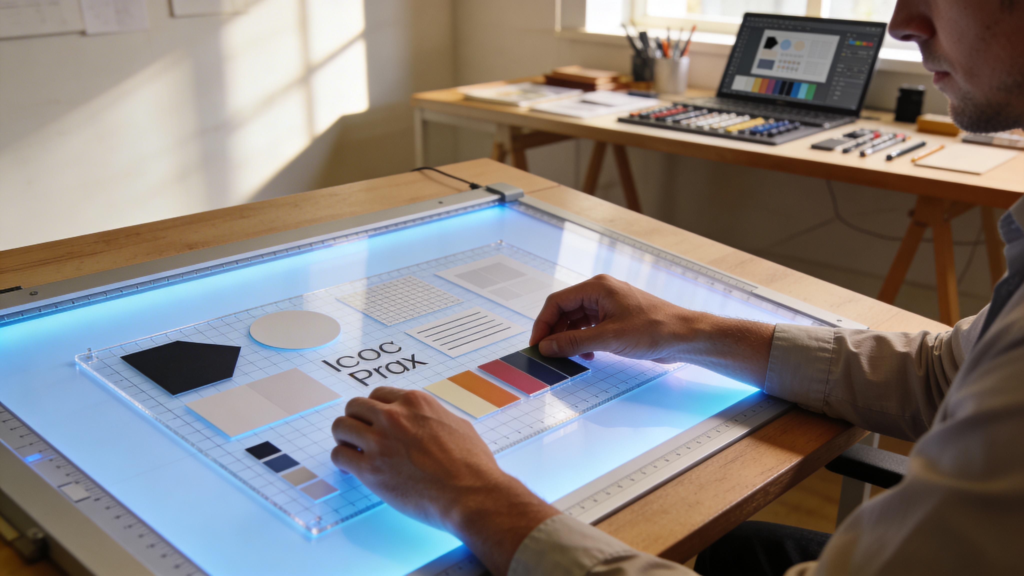
Your designer just shipped a 23-screen Figma file with nested auto-layout, design tokens, and three responsive breakpoints. Your job is to rebuild it in Elementor pixel-perfect, SEO-clean, and responsive by Thursday. If you’ve done this before, you know what’s coming: four to six hours of manual widget placement, spacing corrections that don’t match Figma’s 8px grid, and a mobile view that looks nothing like the mockup.
That translation gap between Figma and Elementor costs agencies an average of 8–12 hours per project in rework alone. Multiply that across 15 client builds per quarter, and you’re burning 120–180 billable hours on tasks that don’t require creative thinking just accurate conversion.
This guide gives you a complete, repeatable Figma-to-Elementor workflow for 2026. You’ll learn how to structure Figma files for clean export, map components to Elementor widgets, handle responsive breakpoints without manual overrides, and automate the parts that eat your time. By the end, you’ll have a system that cuts a typical 5-page site conversion from 6+ hours to under 90 minutes.
TL;DR: The 7-Step Workflow at a Glance
If you’re here for the quick version, here’s the framework. Each step is covered in depth below.
- Audit the Figma file Flatten unnecessary nesting, confirm auto-layout usage, name layers
- Extract design tokens Colors, typography, spacing values into a structured format
- Map components to widgets Match Figma components to Elementor widget equivalents
- Set up the Elementor environment Global styles, theme settings, container structure
- Build section-by-section Top-down conversion using containers (not sections/columns)
- Apply responsive breakpoints Tablet and mobile adjustments using Figma’s responsive specs
- QA and optimize Visual diff, performance audit, SEO checks
Use this as a checklist for every project. Now, the details.
Step 1: Audit and Prepare the Figma File
The biggest source of broken Elementor builds isn’t the build itself it’s a messy Figma file. Unnamed layers, inconsistent auto-layout, and deeply nested frames all translate into bloated HTML and unpredictable widget behavior.
What a “Build-Ready” Figma File Looks Like
Before you touch Elementor, the Figma file needs to meet these criteria:
- Auto-layout on every section and card. If a frame uses absolute positioning, Elementor can’t reliably interpret its spacing. Convert to auto-layout where possible.
- Layer names that describe content, not structure. “hero-section” is useful. “Frame 247” is not. Elementor imports often use layer names as CSS class names or widget labels.
- Maximum 4 levels of nesting. Figma allows infinite nesting. Elementor’s container model works best with 3–4 levels. Flatten anything deeper.
- Consistent component usage. If the same button appears in 12 places, it should be a single Figma component with variants not 12 detached copies. This maps cleanly to Elementor’s global widgets.
The 10-Minute Audit Checklist
Run through this before every conversion:
| Check | Pass Criteria | Fix If Failing |
|---|---|---|
| Auto-layout coverage | 90%+ of frames use auto-layout | Convert fixed frames to auto-layout |
| Layer naming | No default “Frame XXX” names on top 3 levels | Rename with semantic names |
| Nesting depth | ≤ 4 levels for content sections | Flatten or merge intermediate frames |
| Component consistency | Buttons, cards, navs are instances | Detach and recreate as components |
| Responsive variants | Desktop, tablet, mobile frames exist | Create missing breakpoints |
| Hidden layers | No invisible layers cluttering the tree | Delete or move to a “graveyard” page |
This audit takes 10–15 minutes and saves 1–2 hours of debugging downstream. Skip it, and you’ll be reverse-engineering spacing issues in the browser later.
Step 2: Extract and Document Design Tokens
Design tokens are the bridge between Figma’s design system and Elementor’s global settings. Getting these right eliminates the single largest category of visual bugs: inconsistent colors, font sizes, and spacing.
Which Tokens to Extract
Focus on these four categories:
Colors:
- Primary, secondary, accent
- Text colors (heading, body, muted)
- Background colors (surface, card, overlay)
- Border and divider colors
Typography:
- Font families (with fallback stacks)
- Size scale (H1 through body, caption, small)
- Line heights and letter spacing
- Font weights used
Spacing:
- Base unit (typically 4px or 8px)
- Section padding (top/bottom)
- Container gap values
- Card internal padding
Shadows and borders:
- Box shadow values (x, y, blur, spread, color)
- Border radius scale
- Border widths
How to Extract Them Efficiently
Figma’s Dev Mode (available on paid plans) displays CSS values directly. For a faster bulk extraction:
- Use Figma’s built-in variables (released in 2023, now mature). If the designer used variables for colors and spacing, you can export them as JSON.
- Tokens Studio plugin exports design tokens in W3C format. This JSON maps directly to CSS custom properties.
- Manual extraction works for smaller projects. Create a spreadsheet with token name, Figma value, and Elementor equivalent.
A typical 5-page site has 15–25 unique color tokens, 6–8 type styles, and 4–6 spacing values. Document these before building you’ll reference them constantly.
Step 3: Map Figma Components to Elementor Widgets
This is where most workflows break down. Figma components don’t have a 1:1 equivalent in Elementor. A Figma “Card” component might become a container with an image widget, heading widget, text widget, and button widget all with specific spacing and alignment settings.
The Component-to-Widget Translation Table
Here’s how common Figma patterns translate to Elementor in 2026 (using Elementor’s Flexbox Container model, not the legacy section/column system):
| Figma Pattern | Elementor Equivalent | Notes |
|---|---|---|
| Frame with auto-layout (vertical) | Container, flex-direction: column | Set gap to match Figma’s “spacing between items” |
| Frame with auto-layout (horizontal) | Container, flex-direction: row | Use “wrap” if items should stack on mobile |
| Text layer | Heading or Text Editor widget | Match tag level (H1–H6) to Figma’s type style |
| Rectangle with fill | Container with background | Don’t use a separate spacer use padding |
| Image fill on frame | Container with background image | Or Image widget if it’s content (not decorative) |
| Component instance | Global Widget (if reused 3+ times) | Keeps edits synchronized |
| Auto-layout with “space between” | Container with justify-content: space-between | Common for navbars and footer link rows |
| Figma variant (hover state) | Elementor widget hover tab | Map hover colors, transforms directly |
| Figma prototype interactions | Motion Effects or custom CSS transitions | Elementor can’t import Figma prototype animations |
Handling Components That Don’t Map Cleanly
Three Figma patterns consistently cause problems:
1. Overlapping elements (absolute positioning in Figma) Elementor containers don’t natively support overlapping children without custom CSS or the “absolute position” toggle. If the design has a badge overlapping a card corner, use position: absolute on the badge container with manual offset values.
2. Complex grids (masonry, asymmetric) Figma’s auto-layout handles uniform grids well, but asymmetric layouts (2/3 + 1/3 splits, masonry) need manual container width percentages in Elementor. Set the parent container to row direction, then assign each child container a specific width (e.g., 66.66% and 33.33%).
3. SVG animations and micro-interactions Figma prototypes can include smart animate transitions. These don’t export to any page builder. Plan to recreate them with Elementor’s motion effects, Lottie widgets, or custom CSS animations.
Step 4: Configure the Elementor Environment
Before placing a single widget, set up Elementor’s global infrastructure to match your design tokens. This front-loaded effort means you won’t be manually adjusting font sizes and colors on every widget.
Global Colors and Fonts
Navigate to Elementor → Site Settings → Global Colors and create entries for every color token from Step 2. Use the same naming convention as Figma (e.g., primary-500, surface-light). When you later assign colors to widgets, use the global color picker never hardcode hex values.
For typography, go to Site Settings → Global Fonts and set up your type scale:
- Primary: Heading font family
- Secondary: Body font family
- Text: Default paragraph style
- Accent: Special use (captions, labels)
Then create custom typography presets under Theme Style for H1–H6, body, and small text. Match the exact pixel values, line heights, and weights from your Figma tokens.
Container Setup and Default Spacing
Elementor 3.6+ uses Flexbox Containers by default. Confirm this is enabled under Elementor → Settings → Features. Then set your default container preferences:
- Content width: Match Figma’s frame max-width (typically 1200px or 1440px)
- Default gap: Set to your base spacing unit
- Default padding: Match Figma’s section padding (commonly 80px top/bottom on desktop)
Responsive Breakpoints
Elementor ships with default breakpoints at 1024px (tablet) and 767px (mobile). Figma designs often use different breakpoints. To align them:
- Go to Site Settings → Layout → Breakpoints
- Add or modify breakpoints to match the Figma file’s responsive frames
- Common 2026 setup: 1280px (laptop), 1024px (tablet landscape), 768px (tablet portrait), 480px (mobile)
Getting breakpoints aligned here prevents hours of responsive adjustment later.
Step 5: Build Section-by-Section, Top to Bottom
With the environment configured, start the actual build. Work through the Figma design from the top of the page to the bottom, one section at a time.
The Container-First Approach
For each Figma section:
- Create the outermost container Set it to full-width with a boxed inner container matching your content width. Apply the section’s background color or image.
- Add child containers for layout groups If the section has a text block on the left and an image on the right, create two child containers inside a row-direction parent.
- Place widgets inside the innermost containers Headings, text, images, buttons. Match Figma’s layer order.
- Apply spacing from your token sheet Padding, gap, and margin values. Use the global spacing values you documented.
Practical Example: Converting a Hero Section
Suppose your Figma hero section has:
- Full-width background image
- Centered content container (max-width 680px)
- H1 heading, body paragraph, two buttons side by side
- 120px top/bottom padding, 24px gap between elements
In Elementor:
- Create a Container → full width, min-height as needed, background image set to cover + center
- Inside it, create a child Container → max-width 680px, flex-direction column, align center, gap 24px, padding 120px top/bottom
- Add Heading widget → set to H1, apply global H1 typography, apply global heading color
- Add Text Editor widget → body copy, global body typography
- Create a child Container → flex-direction row, gap 16px (for the two buttons)
- Add two Button widgets → primary and secondary styles
Total time for this hero section: 8–12 minutes if your globals are set up correctly. Without globals, you’d spend 25+ minutes adjusting individual widget styles.
Speeding Up Repetitive Sections
For sections that repeat patterns (testimonial grids, feature cards, pricing tables):
- Build one card perfectly
- Save it as a Global Widget if it’ll be reused identically
- Or save it as a template and insert copies, then customize content
- Use Elementor’s copy/paste style feature to apply consistent styling across similar widgets
Tools like Figmentor automate this component-to-widget mapping entirely the plugin converts Figma frames including their auto-layout, spacing, and typography into Elementor-compatible JSON that imports directly into the editor. For agency-scale projects where you’re converting 10+ pages per week, this automation eliminates the repetitive manual placement that eats most of the build time.
Step 6: Apply Responsive Breakpoints Without Losing Your Mind
Desktop-first builds that look broken on mobile are the most common complaint in client reviews. The fix isn’t just “check mobile view” it’s a systematic responsive workflow.
The Breakpoint Cascade Strategy
Work through breakpoints in order: desktop → tablet → mobile. Elementor inherits styles downward, so changes at the desktop level cascade to smaller screens unless overridden.
Desktop (default):
- Build everything at your primary breakpoint (1200–1440px)
- All spacing, sizing, and layout should be final
Tablet (1024px or your custom breakpoint):
- Switch to tablet view in Elementor
- Adjust container directions (row → column for side-by-side layouts that should stack)
- Reduce section padding (120px → 80px is common)
- Scale heading sizes down by 15–20%
- Check that images don’t overflow
Mobile (767px or below):
- All multi-column layouts should be single column
- Reduce section padding further (80px → 48px)
- Scale headings down another 10–15%
- Ensure tap targets are minimum 44×44px
- Hide decorative elements that clutter small screens (use Elementor’s responsive visibility toggle)
The 3 Responsive Issues That Always Appear
1. Text overflow on mobile Long headings that look great at 48px on desktop become two-line disasters on mobile. Set responsive font sizes for every heading level. A good rule: mobile H1 = 60–70% of desktop H1.
2. Horizontal scroll caused by fixed-width elements If any element has a pixel width wider than the mobile viewport (360–414px), the page gets a horizontal scrollbar. Check images, containers with min-width, and embedded iframes.
3. Spacing that feels wrong on small screens A 24px gap between cards on desktop feels fine. On mobile, where cards stack vertically, that same 24px might feel too cramped. Increase vertical gaps on mobile by 25–50%.
Using Figma’s Responsive Frames as Your Reference
If the Figma file includes tablet and mobile frames (it should refer back to Step 1), open them side-by-side with Elementor’s responsive view. Compare:
- Container stacking order
- Font sizes at each breakpoint
- Padding and gap values
- Which elements are hidden on smaller screens
- Image aspect ratios (some designs crop images differently on mobile)
This side-by-side comparison catches 90% of responsive discrepancies before the client ever sees them.
Step 7: QA, Performance Audit, and SEO Checks
Building the page is 70% of the work. The remaining 30% quality assurance is what separates amateur builds from professional ones.
Visual QA: The Overlay Method
Take a screenshot of your Elementor build at the exact viewport width of the Figma frame. Overlay it on the Figma design at 50% opacity. Misalignments of 2px or more will be immediately visible.
Tools for this:
- PixelPerfect Chrome extension overlay images on live pages
- Figma’s Spotlight plugin generates comparison overlays
- Manual screenshot comparison works in a pinch
Check these elements specifically:
- Spacing between sections (most common error)
- Font rendering differences (Figma renders fonts differently than browsers)
- Button padding and border radius
- Image aspect ratios and cropping
- Color accuracy (especially dark backgrounds they reveal subtle shade differences)
Performance Audit
Elementor builds can bloat if you’re not careful. Run these checks:
| Metric | Target | How to Check |
|---|---|---|
| Largest Contentful Paint (LCP) | < 2.5 seconds | Google PageSpeed Insights |
| Total page weight | < 1.5 MB (excluding video) | Chrome DevTools → Network tab |
| DOM elements | < 1,500 nodes | Chrome DevTools → Performance |
| Unused CSS | < 50 KB | Coverage tab in Chrome DevTools |
| Image format | WebP or AVIF | Check in Network tab |
Common Elementor performance fixes:
- Enable Elementor’s built-in asset optimization (Settings → Performance)
- Use lazy loading on below-the-fold images
- Minimize use of motion effects each one adds JavaScript
- Set container height to auto, not min-height with large values (causes layout shifts)
SEO Checklist for Every Page
Elementor builds need manual SEO attention. Check these before launch:
- Heading hierarchy: H1 → H2 → H3 in logical order. No skipping levels.
- Image alt text: Every content image has descriptive alt text. Decorative images use empty alt (
alt=""). - Meta title and description: Set via Yoast, Rank Math, or your SEO plugin. Don’t rely on Elementor’s page title.
- Internal links: Each page links to at least 2–3 other pages on the site.
- Schema markup: Add if relevant (FAQ, product, local business).
- Mobile usability: Run Google’s Mobile-Friendly Test.
Troubleshooting: When Things Go Wrong
Even with a solid workflow, certain issues recur. Here are the five most common and their fixes.
Spacing Doesn’t Match Figma
Cause: Figma’s auto-layout spacing includes padding + gap. Elementor separates padding and gap into distinct properties.
Fix: In Figma, check whether the spacing value is padding (space between the frame edge and content) or gap (space between child elements). Apply them to the correct Elementor property.
Fonts Render Differently in the Browser
Cause: Figma uses its own font rendering engine. Browsers use OS-level rendering, which affects weight perception and letter spacing.
Fix: Don’t chase exact pixel matching for font rendering it’s impossible. Instead, ensure the correct font family, weight, and size are applied. Adjust letter spacing by ±0.2px if a heading looks noticeably tighter or looser than Figma.
Auto-Layout Conversion Produces Wrong Flex Direction
Cause: Figma auto-layout frames can have “fixed” children mixed with “fill” children. Elementor interprets these differently.
Fix: In Figma, ensure all children in an auto-layout frame use consistent sizing (all “fill container” or all “fixed”). Mixed sizing creates unpredictable flex behavior in any CSS-based tool.
Mobile View Has Unexpected Element Order
Cause: Elementor stacks flex children in source order when switching from row to column. Figma’s mobile frame might show a different order.
Fix: Use Elementor’s custom order property on individual containers at the mobile breakpoint. Set order: 1, order: 2, etc., to match the Figma mobile layout.
Page Loads Slowly Despite Optimization
Cause: Too many containers and widgets create excessive DOM depth. A 5-section landing page shouldn’t have more than 800–1,000 DOM nodes from Elementor.
Fix: Audit your container structure. Merge unnecessary wrapper containers. If a container exists only to add background color, apply the background to its parent instead and delete the extra layer.
Honest Limitations of This Workflow
No workflow eliminates all friction. Here’s where you’ll still need manual effort:
- Complex animations Figma prototype animations don’t export. You’ll build these in Elementor from scratch or use Lottie files.
- Dynamic content If the site uses WordPress custom fields (ACF, Pods), you need to connect Elementor’s dynamic tags manually. No Figma export handles this.
- Third-party integrations Forms, payment gateways, and CRM connections are development tasks, not design conversion tasks.
- Edge-case browsers Elementor’s Flexbox Containers have minor rendering differences in Safari vs. Chrome. Test in both.
Figmentor’s conversion engine handles the structural translation auto-layout to Flexbox, typography mapping, responsive breakpoints but animations, dynamic content, and integrations remain manual work in every tool on the market as of 2026.
Your Next Step: Build the System, Then Automate It
The workflow in this guide works for any Figma-to-Elementor project regardless of tools. The key insight is this: most of your build time isn’t spent on creative problem-solving it’s spent on mechanical translation. Tokens become global styles. Components become widgets. Spacing values become CSS properties.
Start with your next project. Run the 10-minute Figma audit. Extract tokens into a spreadsheet. Map components to widgets before you open Elementor. Build one page using this system and time yourself. You’ll likely cut 40–60% off your current build time on that first attempt alone.
Once the manual workflow is solid, look at automating the repetitive parts. Whether you use Figmentor’s plugin pipeline, Tokens Studio for design token syncing, or a custom script the goal is the same: stop rebuilding what’s already been designed.
The gap between Figma and Elementor isn’t a creative problem. It’s a logistics problem. And logistics problems have systems solutions.