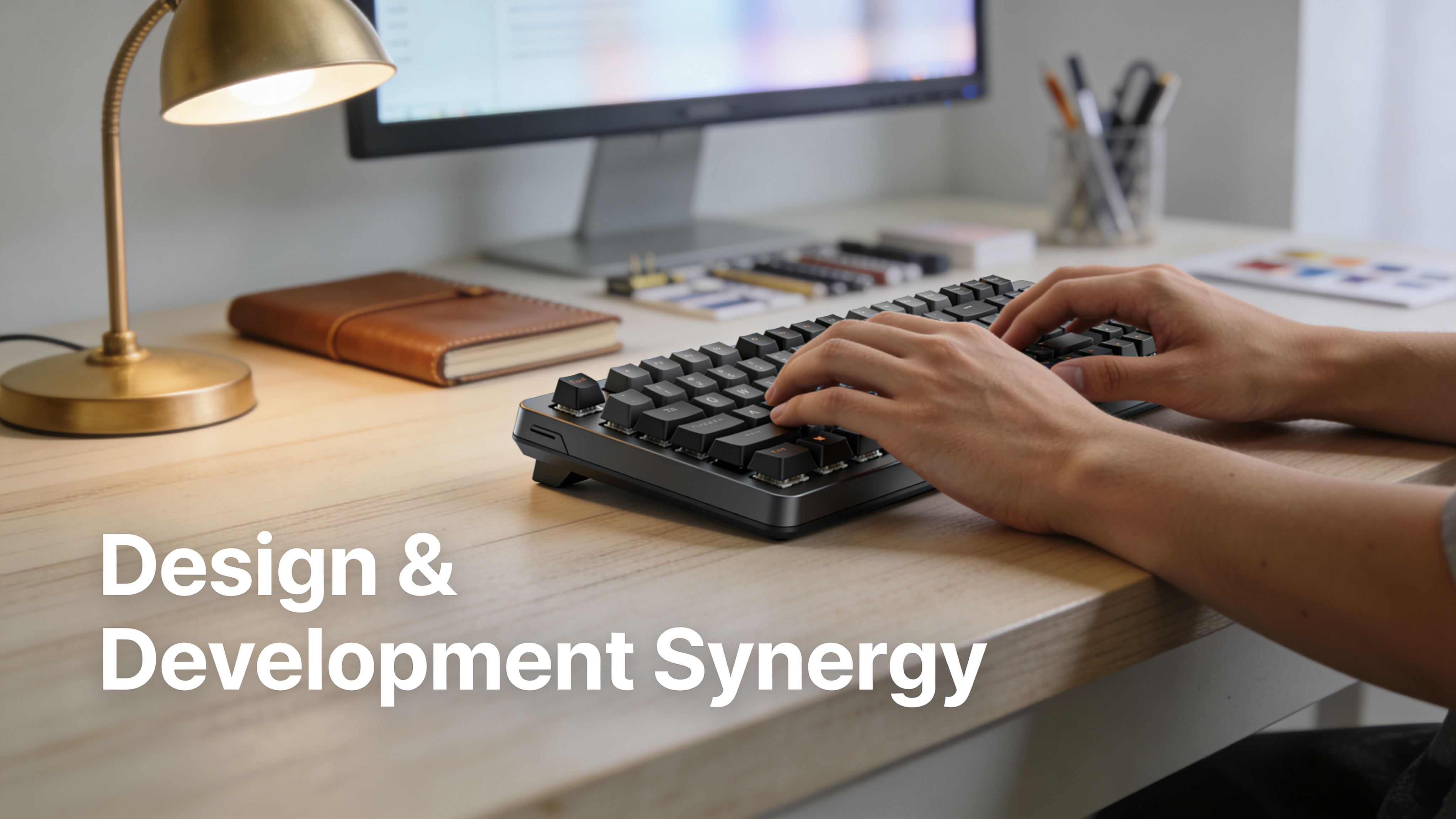

Your Figma file has 87 layers, three breakpoints, a component library, and design tokens your developer has never seen. The Elementor build is due Thursday. Between now and then, someone has to manually recreate every auto-layout frame, match every spacing value, and test every responsive breakpoint or the whole thing ships broken.
This gap between design and production costs agencies an average of 4–8 hours per page. For a 10-page client site, that’s a full workweek spent on translation work that adds zero creative value. Broken spacing, mismatched fonts, and responsive layouts that collapse below 768px aren’t edge cases they’re the default outcome of manual rebuilds.
By the end of this guide, you’ll have a complete Figma-to-Elementor workflow covering design preparation, handoff structure, conversion methods (manual and automated), responsive breakpoint strategy, and quality assurance. Whether you’re a solo freelancer or an agency team shipping five sites a month, every section gives you something you can apply to your next project today.
TL;DR: The 7-Phase Workflow at a Glance
If you’re short on time, here’s the entire Figma-to-Elementor conversion workflow compressed into a scannable framework:
| Phase | What Happens | Time (Manual) | Time (Automated) |
|---|---|---|---|
| 1. Design Audit | Flatten unnecessary nesting, name layers, check constraints | 30–60 min | 30–60 min |
| 2. Token Extraction | Export colors, typography, spacing as reusable values | 45–90 min | 5–10 min |
| 3. Asset Export | SVGs, optimized images, icons at 1x/2x | 20–40 min | 5–10 min |
| 4. Layout Mapping | Map Figma frames → Elementor sections/containers | 60–120 min | 2–5 min |
| 5. Widget Building | Convert Figma components → Elementor widgets | 2–4 hours | 10–30 min |
| 6. Responsive Tuning | Adjust tablet (1024px) and mobile (767px) breakpoints | 1–2 hours | 15–30 min |
| 7. QA & Handoff | Visual diff, accessibility check, performance audit | 30–60 min | 30–60 min |
Total manual time for a 5-page site: 25–40+ hours. With automation: 3–6 hours. The difference compounds with every project.
Phase 1: Preparing Your Figma File for Conversion
A messy Figma file creates a messy Elementor build. No tool manual or automated can compensate for disorganized layers, unnamed components, and inconsistent spacing. Preparation is where you prevent 80% of downstream problems.
Clean Your Layer Structure
Elementor reads structure hierarchically: sections contain containers, containers contain widgets. Your Figma file should mirror this. That means:
- Top-level frames = Elementor sections (full-width rows)
- Nested frames with auto-layout = Elementor containers (Flexbox)
- Leaf elements (text, images, buttons) = Elementor widgets
Flatten any unnecessary nesting. If you have a frame inside a frame inside a frame just to apply one padding value, collapse it. Every extra nesting level creates an extra <div> in Elementor, which bloats the DOM and complicates responsive adjustments.
Name Everything Semantically
“Frame 247” means nothing to a developer and nothing to conversion tools. Use names that describe function:
hero-section→ maps to an Elementor sectioncta-button-primary→ maps to a Button widget with a specific stylepricing-card→ maps to a reusable Elementor container template
Consistent naming also enables automated tools to infer widget types. A frame named “image-gallery” triggers different mapping logic than one named “Group 12.”
Verify Auto-Layout Settings
Elementor’s Flexbox container model maps directly to Figma’s auto-layout but only if your auto-layout is set up correctly. Check every frame for:
- Direction: Horizontal or vertical (maps to Flexbox
roworcolumn) - Gap values: These become Elementor’s gap settings. Use consistent values don’t mix 16px and 17px arbitrarily.
- Padding: Applied to the frame, not the children. Elementor handles padding at the container level.
- Alignment: Fill, hug, or fixed width/height. “Fill” maps to Elementor’s width: 100%. “Hug” maps to auto-width.
Set Constraints for Responsive Behavior
Figma constraints (Left and Right, Scale, Center) give conversion tools hints about responsive behavior. A frame constrained to “Left and Right” on a parent suggests it should stretch across the viewport. A frame constrained to “Center” should remain centered at narrower widths.
Set constraints deliberately on every element you want to behave predictably below 1280px.
Phase 2: Extracting Design Tokens for Elementor Global Settings
Design tokens colors, typography scales, spacing units, border radii are the DNA of your design system. Extracting them before building anything in Elementor saves you from the nightmare of updating 47 heading widgets individually when the client changes the brand font.
Color Tokens
Export your Figma color styles as a structured list. At minimum, you need:
| Token Name | Hex Value | Elementor Global Color |
|---|---|---|
| primary | #2563EB | Primary |
| primary-dark | #1D4ED8 | (custom) |
| secondary | #7C3AED | Secondary |
| text-body | #1F2937 | Text |
| text-muted | #6B7280 | (custom) |
| background | #FFFFFF | (custom) |
| surface | #F9FAFB | (custom) |
| accent | #F59E0B | Accent |
Elementor provides four global color slots by default (Primary, Secondary, Text, Accent). Any additional colors need to be added as custom globals in Site Settings → Global Colors.
Typography Tokens
Map your Figma text styles to Elementor’s global typography system:
| Figma Style | Font / Weight / Size | Line Height | Elementor Mapping |
|---|---|---|---|
| Heading 1 | Inter / Bold / 48px | 1.2 | Primary Heading |
| Heading 2 | Inter / SemiBold / 36px | 1.25 | Secondary Heading |
| Body | Inter / Regular / 16px | 1.6 | Body Text |
| Caption | Inter / Regular / 14px | 1.5 | Accent Text |
Configure these in Elementor → Site Settings → Global Fonts before you build a single page. Changing them later propagates everywhere which is the entire point.
Spacing Scale
Figma’s auto-layout gap and padding values should follow a consistent scale (4px, 8px, 12px, 16px, 24px, 32px, 48px, 64px, 96px). Document this scale and use it as your reference when setting Elementor margins and paddings.
Inconsistent spacing is the #1 reason Elementor builds look “off” compared to the Figma source. A 24px gap in Figma that becomes a 20px margin in Elementor is visible to anyone comparing the two.
Phase 3: Exporting and Optimizing Assets
Asset export is straightforward but often botched. Wrong format, wrong resolution, missing compression any of these creates rework later.
Image Export Rules
- Photos and raster graphics: Export as WebP at 2x resolution (so a 600px-wide hero image exports at 1200px). Quality setting: 80–85%.
- Icons and simple illustrations: Export as SVG. Clean up paths in Figma first remove hidden layers, flatten boolean groups, outline strokes if the icon uses non-standard stroke caps.
- Logos: SVG for the logo itself. PNG fallback only if the SVG contains effects Elementor can’t render (rare in 2026).
- Background patterns and decorative elements: SVG if vector, WebP if raster. Consider whether these should be CSS background-images or Elementor image widgets CSS backgrounds are lighter but less editable for non-technical clients.
Batch Export Workflow
Select all exportable frames in Figma, add export settings per frame, then use Figma’s batch export. Organize into folders:
/assets
  /images
    hero-background.webp
    team-photo.webp
  /icons
    arrow-right.svg
    check-circle.svg
  /logos
    logo-primary.svg
    logo-white.svg
Upload these to your WordPress Media Library before you start building in Elementor. Referencing media that’s already uploaded prevents broken image links and lets you set proper alt text upfront.
Phase 4: Mapping Figma Layouts to Elementor Structure
This is where the actual translation happens and where manual rebuilds consume the most time. You’re converting Figma’s visual hierarchy into Elementor’s structural hierarchy.
Understanding the Structural Mapping
Since Elementor 3.6+, the Flexbox Container replaced the old Section/Column model. This is a direct structural match to Figma’s auto-layout:
| Figma Concept | Elementor Equivalent | CSS Equivalent |
|---|---|---|
| Frame (auto-layout) | Container | display: flex |
| Horizontal layout | Container (direction: row) | flex-direction: row |
| Vertical layout | Container (direction: column) | flex-direction: column |
| Gap | Container gap | gap |
| Padding | Container padding | padding |
| Fill width | Container width: 100% | width: 100% |
| Hug contents | Container width: auto | width: fit-content |
| Fixed size | Container width: Xpx | width: Xpx |
| Component | Template / Global Widget |
The Nesting Strategy
Build outside-in. Start with the outermost section, then nest containers, then place widgets.
Example A pricing section with three cards:
- Outer container: Full-width, vertical direction, centered content, max-width 1200px, padding 64px top/bottom
- Heading container: Contains H2 (“Pricing”) and paragraph widget (subheading). Vertical direction, gap 16px.
- Cards container: Horizontal direction, gap 24px, wrap enabled for responsive fallback
- Individual card (×3): Vertical container, padding 32px, background white, border-radius 12px, box-shadow
- Card contents: H3 (plan name), paragraph (price), unordered list (features), button widget
This 5-level hierarchy maps exactly to how you’d structure it in Figma with auto-layout frames. The key difference: Elementor requires you to manually recreate it, widget by widget.
Where Manual Mapping Breaks Down
Manual conversion works for simple layouts a hero, a few content sections, a footer. It breaks down when:
- You have 20+ components that repeat across pages (cards, testimonials, feature blocks). Each one needs individual rebuilding.
- Spacing inconsistencies creep in. Your Figma file uses 24px gaps everywhere, but by page 3 of the Elementor build, you’ve accidentally set some to 20px and some to 28px.
- Responsive behavior wasn’t planned. The Figma desktop design looks great, but nobody designed the tablet or mobile variants and now you’re guessing at breakpoint behavior in Elementor.
Automated tools address these problems by converting the Figma structure programmatically. Figmentor’s plugin, for example, reads your auto-layout frames and generates the equivalent Elementor container JSON preserving gaps, padding, direction, and nesting depth automatically. That eliminates the manual mapping step entirely for standard layouts.
Phase 5: Building Components as Elementor Widgets
Components are the highest-leverage part of your conversion. A well-built Elementor template part (formerly “Saved Section”) lets you reuse the same card, CTA block, or navigation element across dozens of pages.
Converting Figma Components to Global Widgets
Figma components with variants map conceptually to Elementor’s Global Widgets or template kits. Here’s the practical conversion:
Figma component with 3 variants (e.g., Button/Primary, Button/Secondary, Button/Ghost):
In Elementor, you have two options:
CSS classes approach: Build one button widget, then apply different CSS classes (
.btn-primary,.btn-secondary,.btn-ghost) that change background, border, and text color. Most flexible, but requires custom CSS.Template parts approach: Build three separate button templates, each styled differently. Easier for non-technical editors, but harder to maintain if the base style changes.
For agencies delivering to clients who’ll edit the site, option 1 is better. For freelancers doing one-off builds, option 2 is faster.
Handling Complex Components
Some Figma components don’t have clean Elementor equivalents:
- Tabs with custom styling: Elementor’s Tabs widget has limited styling options. You’ll likely need a container-based approach with custom JavaScript toggle logic or a third-party widget from JetElements or Essential Addons.
- Animated interactions: Figma’s Smart Animate has no direct Elementor equivalent. Use Elementor’s Motion Effects (scroll-triggered fade, slide, zoom) for simple animations. For complex sequences, you’ll need GreenSock (GSAP) via custom code.
- Data-driven lists: Figma’s auto-layout list of 8 identical items with different content maps to Elementor’s Loop Builder (requires Elementor Pro 3.8+). If your layout shows dynamic content from a CPT, use the Loop Grid widget with a custom template.
Component Conversion Checklist
For each Figma component, verify:
- All text styles map to Elementor global fonts
- All colors reference Elementor global colors (not hardcoded hex values)
- Spacing uses consistent values from your documented scale
- Hover/active states are styled in Elementor (separate tab per widget)
- The component is saved as a template for reuse
Phase 6: Configuring Responsive Breakpoints
Responsive design is where Figma-to-Elementor projects fail most visibly. The design looks perfect at 1440px. At 768px, headings overflow, images stack awkwardly, and padding disappears.
Elementor’s Default Breakpoints (2026)
| Breakpoint | Width | Common Devices |
|---|---|---|
| Widescreen | 2400px+ | Ultra-wide monitors |
| Desktop | 1025px – 2399px | Laptops, monitors |
| Tablet Landscape | 1025px – 1199px | iPad Pro landscape |
| Tablet | 768px – 1024px | iPad portrait |
| Mobile Landscape | 481px – 767px | Phones landscape |
| Mobile | 0px – 480px | Phones portrait |
You can customize these under Elementor → Settings → Experiments → Additional Custom Breakpoints. Most projects need at minimum: Desktop (1280px design width), Tablet (768px), and Mobile (375px).
Matching Figma Breakpoints to Elementor
If your Figma file has three frames Desktop (1440px), Tablet (768px), Mobile (375px) you’re in good shape. Map them directly:
- Build the desktop layout first in Elementor at full width
- Switch to Tablet view (responsive mode) and adjust container direction, font sizes, padding, and visibility
- Switch to Mobile view and do the same
Common adjustments per breakpoint:
- Container direction: Horizontal on desktop → Vertical on tablet/mobile for multi-column layouts
- Font sizes: H1 at 48px desktop → 36px tablet → 28px mobile
- Padding: 64px section padding desktop → 48px tablet → 32px mobile
- Visibility: Some elements (decorative illustrations, secondary CTAs) can be hidden on mobile using Elementor’s responsive visibility toggle
- Image sizing: Full-width hero images may need
object-fit: coverwith reduced height on mobile
The Column Collapse Problem
The most frequent responsive issue: a 3-column layout on desktop that collapses to a single column on mobile, but the order is wrong. In Figma, left-to-right columns read top-to-bottom on mobile. But if your Figma mobile design puts the CTA button before the feature list (reversing the desktop order), you need Elementor’s Order property on individual containers.
Set Order: 1 on the element you want first, Order: 2 on the second, and so on. This reorders children within a Flexbox container without changing the desktop layout.
Where Automated Tools Save Hours
Responsive tuning is the phase where automation pays for itself most dramatically. Manually adjusting font sizes, padding, container direction, and element visibility across three breakpoints for 10 pages means touching hundreds of individual settings. Figmentor’s responsive breakpoint engine reads your Figma tablet and mobile frames and maps the differences automatically so a font that’s 48px on desktop and 28px on mobile in Figma arrives in Elementor with those responsive overrides already set.
Phase 7: Quality Assurance and Visual Diffing
You’ve built the Elementor site. Before you ship, you need to verify that what’s on screen matches what’s in Figma and that it performs well enough to rank.
Visual Comparison Method
Open your Figma design and the Elementor preview side by side. Check each section for:
- Typography: Font family, weight, size, line height, letter spacing. The most common miss is line height Figma’s
Autoline height often computes to a different value than Elementor’s default. - Spacing: Measure padding and gaps. Use browser DevTools (Inspect Element → computed styles) to verify exact pixel values.
- Colors: Compare hex values. If you used Elementor global colors, spot-check that they match the Figma color tokens.
- Alignment: Centered elements should be truly centered. Left-aligned text should have consistent left margins across sections.
- Images: Correct aspect ratio, proper resolution (no blurriness on Retina screens), correct crop.
Performance Audit
Run the live page through Google PageSpeed Insights. Target scores:
- Performance: 90+ (desktop), 75+ (mobile)
- Accessibility: 95+
- Best Practices: 95+
- SEO: 95+
Common Elementor performance killers to watch:
- Unused CSS from Elementor widgets you deleted (purge with Elementor → Settings → Performance → Improved CSS Loading)
- Unoptimized images (use ShortPixel or Imagify for automatic WebP conversion and compression)
- Excessive DOM size from over-nested containers (target under 1,500 DOM elements per page)
- Render-blocking Google Fonts (self-host fonts via OMGF or Perfmatters)
Accessibility Quick Check
- All images have descriptive alt text
- Heading hierarchy is sequential (H1 → H2 → H3, no skips)
- Interactive elements (buttons, links) have sufficient color contrast (4.5:1 minimum)
- Forms have labeled inputs
- Focus states are visible for keyboard navigation
Honest Limitations: What This Workflow Doesn’t Solve
No Figma-to-Elementor workflow manual or automated handles everything perfectly. Be aware of these gaps:
Custom interactions and micro-animations designed in Figma prototyping mode don’t convert to CSS/JS automatically. You’ll need to implement scroll-triggered animations, hover transitions, and page transitions manually using Elementor’s Motion Effects or custom GSAP code.
Dynamic content and WordPress functionality contact forms, WooCommerce product grids, membership gating, dynamic CPT archives exist outside the Figma-to-Elementor pipeline. These require WordPress development knowledge that’s separate from layout conversion.
Third-party plugin styling (Gravity Forms, WooCommerce, LearnDash) often injects its own CSS that conflicts with your Elementor design. Budget time for custom CSS overrides when your design includes styled forms, checkout flows, or LMS interfaces.
Edge-case typography rendering differs between Figma (which uses its own rendering engine) and browsers (which use the OS font renderer). Subtle differences in letter spacing, line height rounding, and font smoothing mean pixel-perfection at the sub-pixel level is a myth. Aim for functional accuracy, not microscope-level matching.
Choosing Your Conversion Method: Decision Framework
Not every project needs the same approach. Use this framework:
Manual build in Elementor if:
- The project is 1–2 pages
- The design is simple (hero, content sections, footer)
- You’re learning Elementor and want hands-on practice
- Budget is near zero
Semi-automated (design tokens + manual build) if:
- The project is 3–7 pages
- You have a design system with reusable components
- You want consistency but don’t mind building layouts by hand
- Typical time: 2–4 hours per page
Fully automated (Figma plugin → Elementor import) if:
- The project is 5+ pages
- You need responsive breakpoints mapped automatically
- You’re shipping multiple client sites per month
- Typical time: 15–45 minutes per page plus QA
For the fully automated path, tools like Figmentor convert your Figma frames into Elementor-compatible JSON with container structure, design tokens, and responsive overrides preserved. The output imports directly into Elementor, giving you a production-ready starting point that needs refinement rather than rebuilding from scratch.
Conclusion: Your Next Step
The Figma-to-Elementor workflow isn’t one process it’s seven phases, each with specific outputs that feed the next. Design audit → token extraction → asset export → layout mapping → widget building → responsive tuning → QA. Skip or rush any phase and the result is a site that looks “close enough” but never matches the original design.
Start with your current project. Run through the Phase 1 checklist on your Figma file today: clean your layers, name them semantically, verify auto-layout settings, and set constraints. That 30–60 minute investment prevents hours of debugging in Elementor later. From there, extract your design tokens and decide whether you’re building manually or automating the layout conversion. Either way, you now have the complete framework to ship Figma-to-Elementor projects faster, with fewer errors, and with responsive behavior that actually works.