

Introduction
Creating responsive websites is no longer optional-it’s a necessity. With users accessing content on various devices, ensuring a seamless experience across all screen sizes is critical. For designers and developers using Figma and Elementor, leveraging Figma Auto Layout can significantly improve responsiveness and workflow efficiency.
In this guide, we’ll explore:
- What Figma Auto Layout is and why it matters
- How to use Auto Layout to design responsive pages
- Best practices for converting Figma designs to Elementor
- Advanced techniques for optimizing Elementor responsiveness
By the end, you’ll have a clear roadmap for using Figma Auto Layout to enhance Elementor pages, ensuring better performance, UX, and conversion rates.
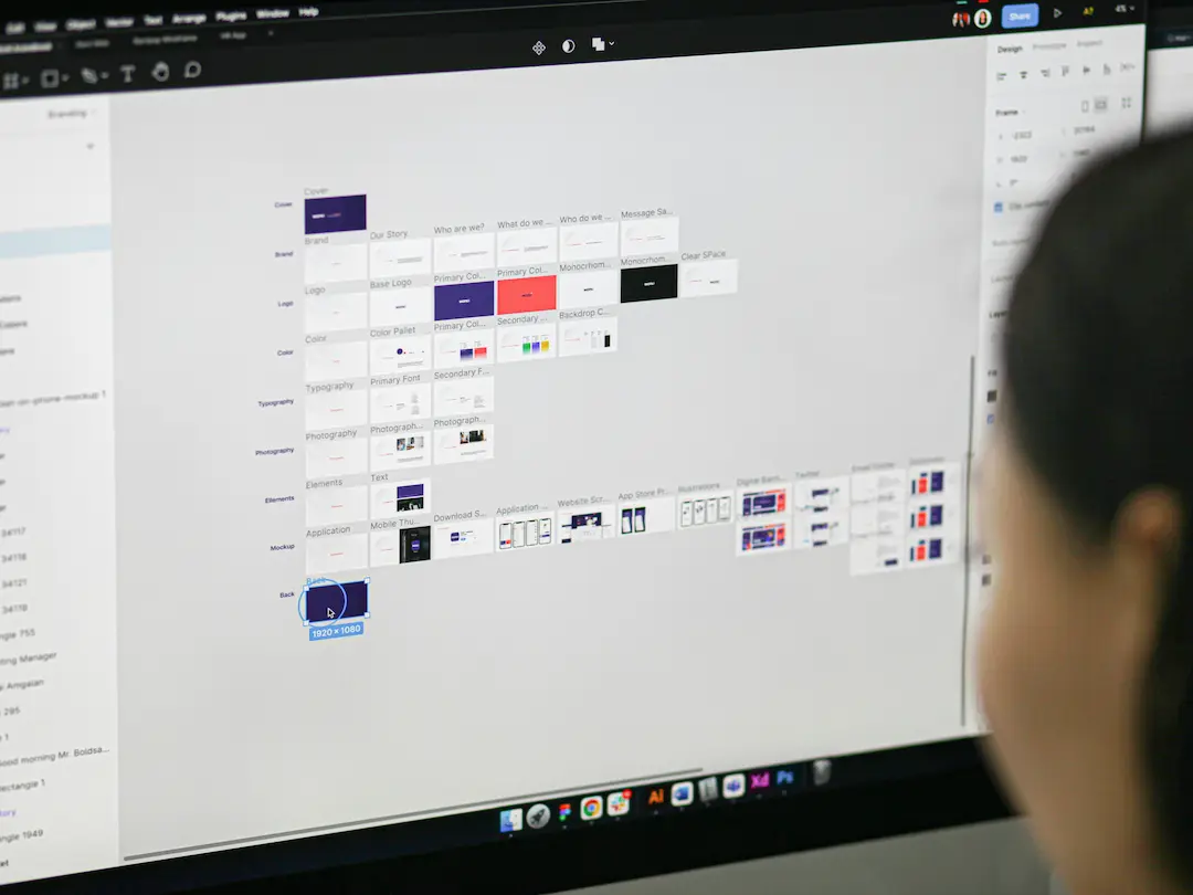
What is Figma Auto Layout?
Figma Auto Layout is a powerful feature that allows designers to create dynamic, responsive components that adapt to content changes. Instead of manually adjusting elements, Auto Layout automatically resizes and repositions them based on predefined rules.
Key Benefits of Figma Auto Layout
✅ Faster Design Iterations – No need to manually adjust spacing or alignment. ✅ Consistent Spacing & Alignment – Maintains uniformity across components. ✅ Responsive Design Ready – Easily adapts to different screen sizes. ✅ Better Collaboration – Developers get clean, structured designs for implementation.
For Elementor users, this means smoother transitions from design to development, reducing discrepancies and improving efficiency.
Why Use Figma Auto Layout for Elementor Pages?
Elementor is a leading WordPress page builder, but ensuring responsiveness can be challenging. By using Figma Auto Layout, you can:
- Streamline Workflow – Designers and developers work in sync.
- Improve Responsiveness – Auto Layout ensures elements adapt to different screens.
- Reduce Manual Adjustments – Fewer tweaks needed in Elementor.
- Enhance UX – Consistent spacing and alignment lead to better user experiences.
Step-by-Step: Using Figma Auto Layout for Elementor Responsive Design
Step 1: Setting Up Auto Layout in Figma
- Select a Frame or Group – Choose the elements you want to make responsive.
- Enable Auto Layout – Right-click and select “Add Auto Layout” or use the shortcut (
Shift + A). - Configure Padding & Spacing – Adjust padding, gaps, and alignment to control how elements behave.
Step 2: Designing Responsive Components
- Use Nested Auto Layouts – For complex sections (e.g., headers, footers, cards).
- Set Minimum & Maximum Widths – Ensures elements don’t stretch or shrink too much.
- Test Different Breakpoints – Use Figma’s Prototyping mode to simulate responsiveness.
Step 3: Exporting Figma Designs for Elementor
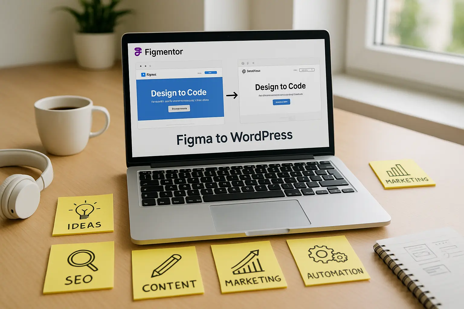
- Use Figma Plugins – Tools like Figma to Elementor or Figma to WordPress can automate the conversion.
- Export Assets – Ensure all images, icons, and fonts are properly exported.
- Use CSS for Fine-Tuning – If needed, manually adjust styles in Elementor.
Step 4: Implementing in Elementor
- Import Designs – Use Elementor’s Template Library or third-party plugins.
- Adjust Responsive Settings – Use Elementor’s Responsive Mode to fine-tune breakpoints.
- Test on Multiple Devices – Ensure consistency across desktop, tablet, and mobile.
Best Practices for Figma Auto Layout & Elementor Responsiveness
1. Use Consistent Spacing & Padding
- Stick to a grid system (e.g., 8px, 16px increments).
- Avoid arbitrary spacing to maintain alignment.
2. Leverage Nested Auto Layouts
- Helps in managing complex sections like navigation menus or product cards.
3. Test Early & Often
- Use Figma’s Prototyping and Elementor’s Preview Mode to catch issues early.
4. Optimize for Performance
- Minimize unnecessary layers in Figma.
- Use Elementor’s Performance Settings to reduce load times.
5. Use Plugins for Automation
- Figmentor (Figma to Elementor plugin) can speed up the conversion process.
- Elementor Add-ons like Essential Addons enhance responsiveness.
Advanced Techniques for Better Responsiveness
1. Dynamic Content Handling
- Use Elementor’s Dynamic Tags to pull content from WordPress.
- Ensure Figma Auto Layout accommodates variable text lengths.
2. Custom Breakpoints in Elementor
- Go beyond default breakpoints (e.g., 768px, 1024px).
- Use Elementor’s Custom Breakpoints for precise control.
3. Conditional Display Logic
- Hide/show elements based on device size.
- Use Elementor’s Visibility Settings for better UX.
Common Mistakes to Avoid
❌ Ignoring Breakpoints – Always test on multiple screen sizes. ❌ Overcomplicating Auto Layouts – Keep structures simple for easier conversion. ❌ Not Using Plugins – Automation tools save time and reduce errors. ❌ Skipping Performance Checks – Optimize images and scripts for faster loading.
Conclusion
Using Figma Auto Layout for Elementor responsive pages is a game-changer. It bridges the gap between design and development, ensuring smoother workflows, better UX, and higher conversions.
By following the steps and best practices in this guide, you’ll be able to: ✔ Design responsive layouts efficiently in Figma. ✔ Convert designs to Elementor with minimal manual adjustments. ✔ Optimize for performance and user experience.
Start implementing these techniques today and see the difference in your WordPress and Elementor projects!
FAQ Section
1. What is Figma Auto Layout?
Figma Auto Layout is a feature that automatically adjusts spacing and alignment in designs, making them responsive and easier to adapt to different screen sizes.
2. How do I convert Figma designs to Elementor?
You can use plugins like Figmentor or manually export assets and rebuild the design in Elementor using its drag-and-drop interface.
3. Can I use Figma Auto Layout for complex Elementor pages?
Yes! By using nested Auto Layouts and proper breakpoints, you can design complex pages that work well in Elementor.
4. What are the best plugins for Figma to Elementor conversion?
Popular options include Figmentor, Anima, and Figma to WordPress plugins that automate the process.
5. How do I ensure my Elementor pages are fully responsive?
Test on multiple devices, use Elementor’s Responsive Mode, and fine-tune breakpoints for optimal display.
Suggested articles
- How to Use Advanced Figma Features to Speed Up Your Elementor Builds
- Elementor Template Kits: How to Build Them Directly from Figma
- How to Convert Figma to Elementor in Under 5 Minutes Without Coding
- Elementor for Figma Designers: Why This Combo Saves 100 Hours
- How to Build Elementor Templates Directly from Figma Designs
- Ultimate Guide: Converting Figma Designs to Elementor Templates
- Top 5 Figma Export Problems for WordPress and Elementor Fixes That Work in 2025
- Figma to WordPress: The Ultimate Guide for Designers and Developers